BRAND AND WEBSITE DESGIN FOR PERSONAL TRAINING IN MELBOURNELift to Last
Byrd needed a website that clearly communicated Lift to Last as a fun, sustainable training philosophy, not just workouts, while positioning him as a trusted coach and authority in strength and movement.
The Challenge
Byrd needed a website that clearly explained who Lift to Last is for and what makes it different. The site had to balance credibility with approachability, educate potential clients, and support long term growth through content, without feeling cluttered or overly sales driven.
The Solution
A structured website that reflects Byrd’s coaching style and training philosophy. The site was built to be easy to update, with clear pathways for services. I also built out a Lead Magnet funnel and blog (which are easy to turn on when they’re needed). The structure supports authority building through blogs and resources, while keeping the experience simple for visitors.
The Outcome
Lift to Last now has a website that communicates its fun approach to training. Byrd has a platform that supports content creation, builds trust over time, and gives potential clients confidence before they ever step into a session. The logo and overall brand design rejects traditional cliches in fitness, helping clients connect to the core values of the business.
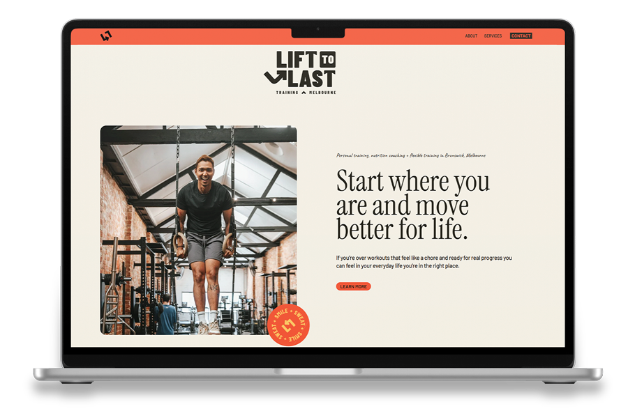
(01) WEBSITE HOMEPAGE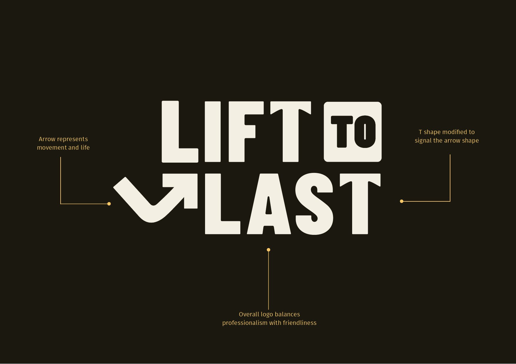
(02) CUSTOM LOGO BREAKDOWN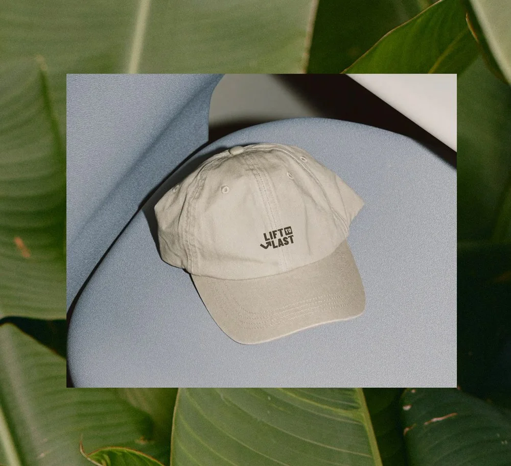
(03) MERCH MOCKUP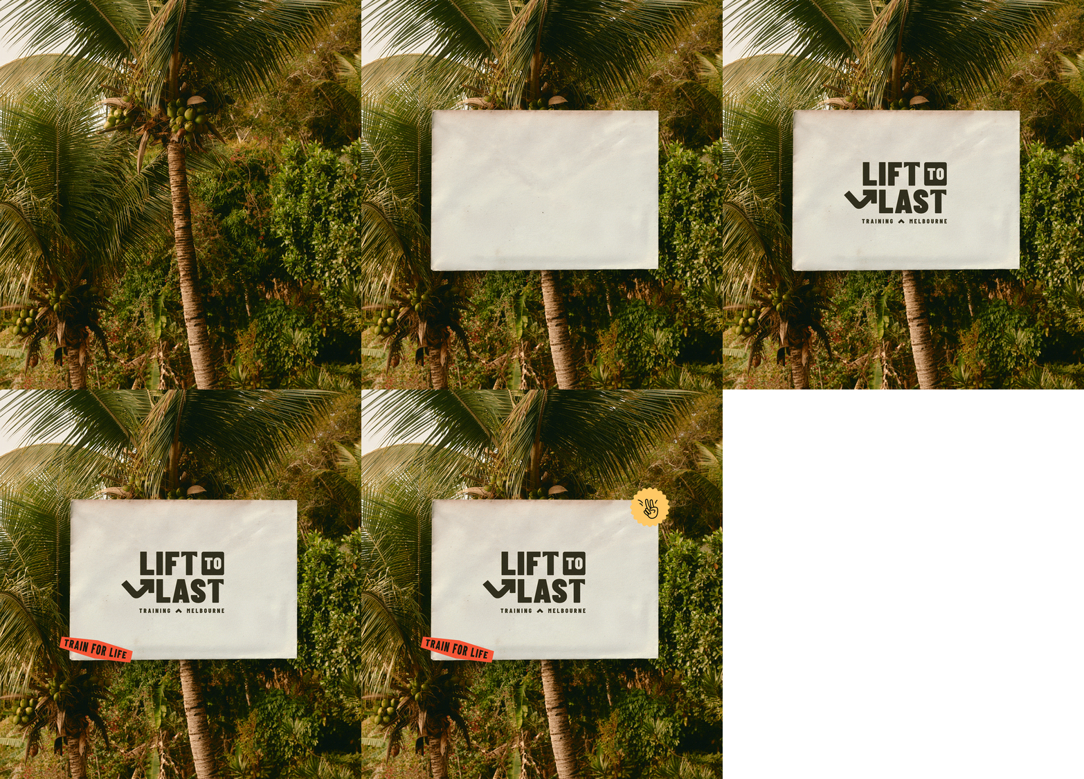
(04) BRAND VIBE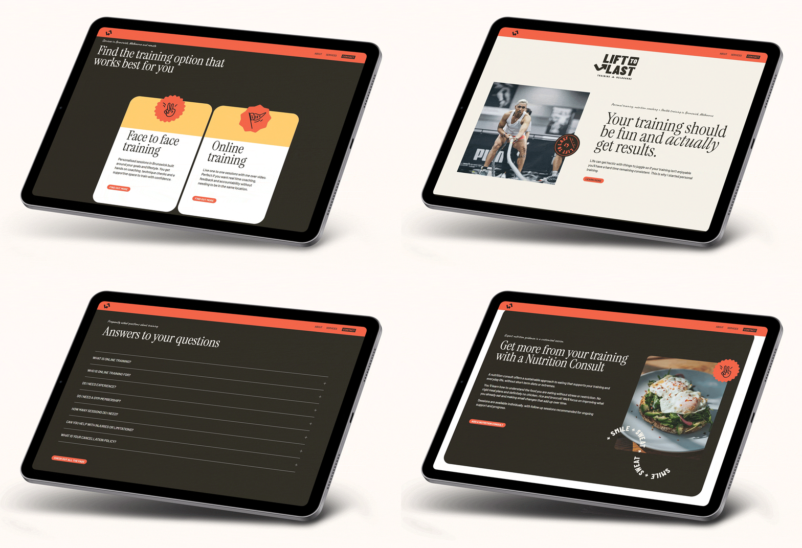
(05) DEVICE MOCKUPSVisuals that reflect Lift to Last’s values of longevity, strength, consistency and fun.
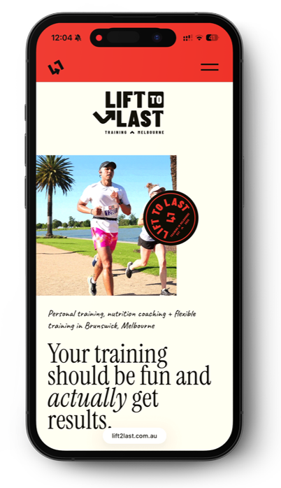
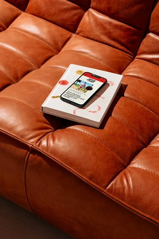
(06) PHONE MOCKUPS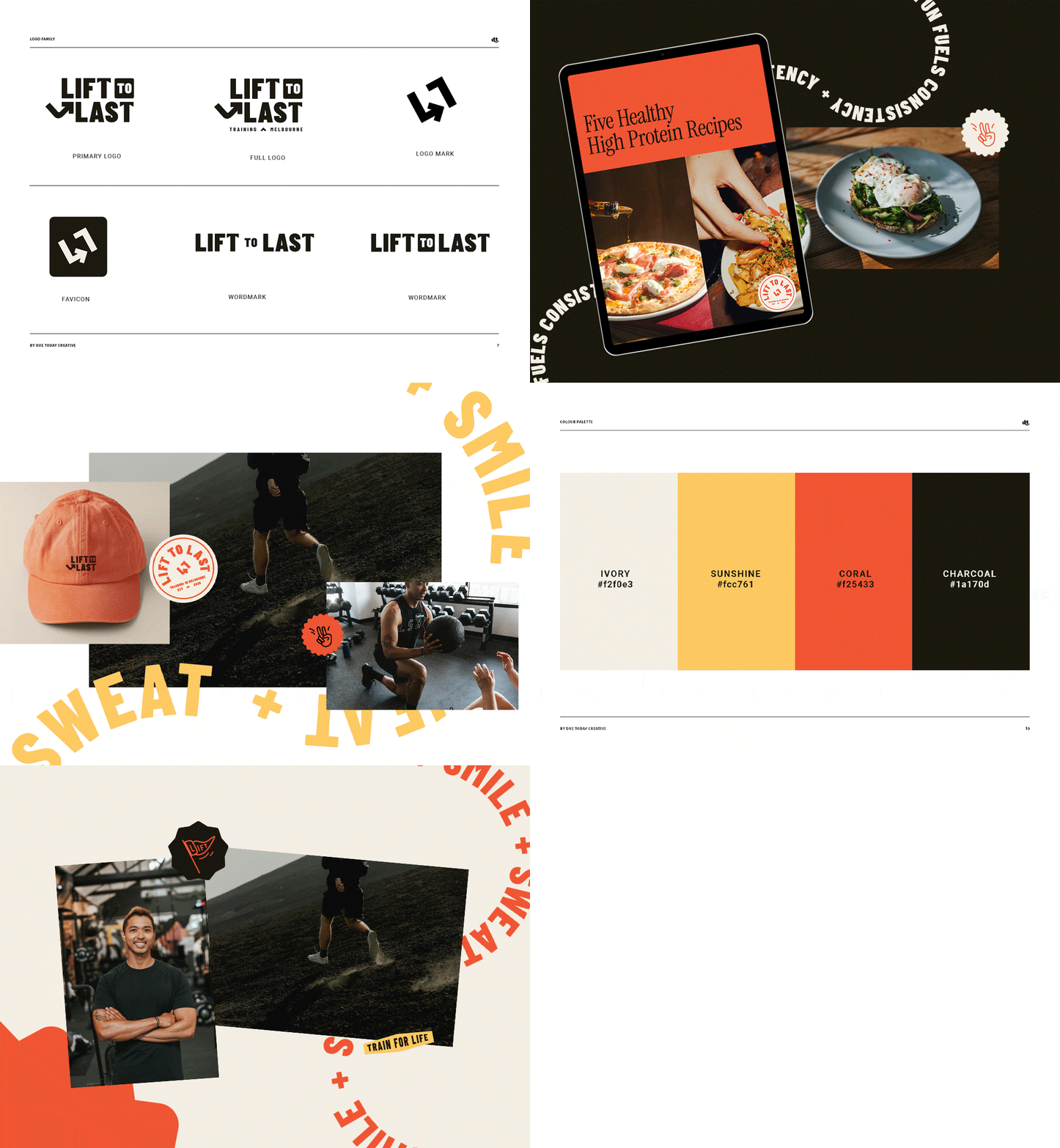
(05) BRAND — LOGO FAMILY — COLOUR PALETTE ● LET’S BREAK BORING
● LET’S BREAK BORING
CLIENT TESTIMONIALSThis is why I do what I do!
“I'm super happy with my website and glad that I went with you. The finished result is so professional and unique to my brand and style.”

● ADAM BOONPRAKOB-NAUGHTON ● DANCER & ACADEMIC

It’s time for you to break boring.
If you’re ready to stop showing up the way you think you should, and start showing up the way your brand and audience need you to show up let’s work together!
